
Experiencing Bravely Default II: As A Fan, It Hits You "Right In The Soft Bits".
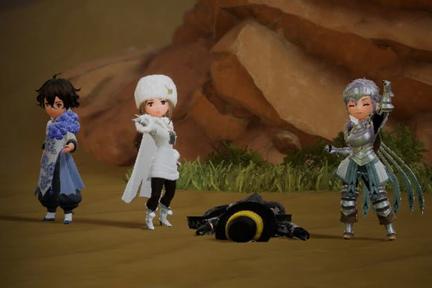
I say that because...this is not a Bravely Default game. Call it anything else and it's certainly a decent game if nothing else.
I don't like giving numeric scores because there's often more to it...So hopefully - HOPEFULLY - you will actually read the review in its entirety to understand why it's such a struggle to just attach a straight up number.
I played - and beat - Bravely Default and Bravely Second.
Default had a better story, Second was a better game (engine, graphics, QoL, etc).
This comes along and I was hoping they would keep what they got right in both but bring us something special; and maybe not having access to the 3DS limited their creativity this time...but what we got was a basic experience that is nowhere near as memorable as the others.
What I Liked
✅ I do like the paint-looking style of the various cities.
✅ Many of the jobs are either superior versions of the prior or have a stronger purpose and use.
✅ The English voice actors do a decent job of bringing life to each character - I noted one NPC appeared to be the same voice actor as Nia from Xenoblade Chronicles 2, based on the very unique pronunciation of "here".
What I Didn't Like
❌ Very, very lacking character development. You end up with a full party of the same characters you end the game with less than an hour into the game and while you do eventually learn about them in their home towns, it's just a flash-in-the-pan type reveal of "TADA!!, I'm ____" feels. Rushed and no build whatsoever. Trust is just granted to random strangers with no real logic. Other characters are mentioned by name but never depicted in any cutscene or anything else.
❌ The ship function, which replaced the old town building online feature of Default and the space-port feature of Second, is actually less of a time sink but feels tacked on and lacks depth of any kind. Islands and lands are referenced that you can never visit or see, and it's just a log of events that happen to give you items. This felt like a missed opportunity to create a much bigger world. Thus leading me to my next issue...
❌ The world is TINY. In Bravely Default and Second, the map was a contiguous (meaning, everything all in one "load", if you can think of it that way) thing where you can visit whichever towns without separate load screens. Here, there are only a select few actual towns, and the map is comprised of four smaller "chunks" where there's a load to visit the next "chunk". Which brings me to my next issue...
❌ LOAD TIMES. I'm just appalled. I haven't had an experience like this since Ark of Napishtim on the PSP (which had egregious load times). Same deal as that game; there's a load before a cutscene, load after said cutscene, load entering and exiting towns, load entering and exiting certain buildings in towns, load entering and exiting parts of the map, load to just VIEW the larger map, load between map segments in the world(!), etc.
This is not an optimized game, by any stretch. Not when you have Breath of the Wild and Xenoblade Chronicles 1 AND 2 AND Torna running around with huge, lush environments and very minimal loading. I get it - different engine, but that's my point: Bravely Default and Bravely Second pulled it off on a lesser console. I'm not sure why Silicon Studio wasn't called in to do this game, but it feels like Claytechworks was way out of their league for this as a first outing on something other than a phone (their core specialty platform).
❌ Performance - meaning, along with the aforementioned load times, the game can't seem to manage a stable framerate at any point, handheld or docked. There are numerous instances of stuttering or delays in response that I find completely unacceptable. Especially since the parts of the game where you see this don't have a lot going on; like just exiting a cave with nothing but grass around.
❌ Asterisk Abilities are strategically placed to force (encourage?) you to dedicate time to jobs that you would otherwise completely ignore. Things like MP Saver or Spearhead, which are buried under Beastmaster, a role that is a good supplement for any magic user and yes, with patience can be a solid contributor, but let's be honest: end game, you're not using Beastmaster in your team, it has too many flaws and limitations that I won't cover here.
❌ The game uses individual turn-based, rather than round-based or true Active Time Battle-based, battle engine. Individual turn-based means that there's a sequence, governed largely (but not completely) by Speed rating. You can't see who will go next between you and the enemy. There's a double exclamation marker to tell you when an enemy is close to taking a turn, but that may be 1 turn away or next, you don't know. Within your team, you can tell who's going next, but an enemy could go before they do.
Put simply: this is a terrible UX (user experience) approach.
If you played Trails of Cold Steel series...you know the indicator to the upper left where you can see who's about to take a turn? That's what this is - without the indicator. Now, imagine how that completely changes the game. You wouldn't be able to know who got Deathblow or who's about to take two turns. Don't agree with that strategy.
❌ The weight management system (which isn't as horrible as Super Hydlide, but same basic concept) adds frustration to an already frustrating experience by ensuring that you either go without weapons (a viable strategy) or go without the best equipment.
❌ Almost all of the QoL enhancements seen in Second are completely gone. You can't adjust JP, EXP or encounter rate (there's an item to make it to where enemies don't see you as easy), there's no auto-battle (for boring mob grinding), etc.
❌ In Default, many of the Asterisk bosses had a strong purpose and intent about them which added to the satisfaction of wrecking them. There's some of that early on here, but many of them just show up, do a thing and get beat. Like Gambler (yes, I know the "circumstances", that's fine) or many of the ones in Chapter 4+.
❌ The UI (user interface) is not well thought out. It would work on a mobile phone (imagine that), it doesn't work here. Why? Because too many clicks are required to do things. I left this complaint for last because it's so extensively bad.
There are three different maps. Yes, three.
The navigation map, which you have to zoom in and out of to be able to see where you're going, doesn't show quest markers and it doesn't show town names.
The travelouge map, which is required to see where quest markers are, has no zoom function, doesn't show dungeon locations and is the only way to set or unset quest markers when you have more than 3 out; this of course requires numerous excessive clicks (a click to "view" the list, a click to select, a click to unselect - meaning it won't just do a deselect/select toggle with one button).
The wagon travel map, which is only viewable when using wagon travel, ONLY shows towns. Which means you could have literally just added travel straight to the travelouge map and provided zoom and quest marker functions straight off, then just scoped a zoom for navigation. Instead, you're forced to enter a town (wait for load), find the guy who does it, talk to them, select a town (wait for load). This is not good UI OR UX.
When you want to view progress on a Job, you go to Job. Great. But from there, you can't view equipped Abilities.
When you want to view equipped Abilities, you go to Abilities. Great. But from there, you can't tell what the current Attribute levels are.
When you want to view Attributes, you go to Attributes. Great. But it doesn't show you the correct information (there are Abilities that let you combine the Attributes of jobs. The Attributes menu doesn't take this into account, it shows "base" Attributes). You also can't see or change Abilities from here to see how Attributes would change.
This all is avoided by simply having ONE screen from where you can change Abilities or Jobs and see Attribute changes. It's mind boggling this isn't here; it's a stalwart of every RPG I can think of.
If you want to see all Abilities available (job and sub-job), you're forced to click back and forth between the Jobs, then click another button to "move" the cursor over to the Ability list, then another click of a different button to get the description to show up. Why???
It is at this point it became clear: this developer was building based on the assumption of limited screen real estate. But there's no need. Scrolling is a thing! Submenus are a thing (they did it for items)!
Even Octopath Traveler managed to have some logic to their layout.
And the items list. You can't sort it. You can't organize it. Eventually, you're doing excessive scrolling to get down to the item you want, because there's no way to just get to it any other way. It's a dumping ground. This was appalling, since games as far back as the PS1 had better organization than this.
That's a lot of complaints, I know.
It's not a terrible game, it's certainly worth playing through and yes, there are fun moments of it. But it's a significant step back from those that came before it, and many design decisions simply aren't good.